The development of the mega-menu is based on previous internal and customer projects.
It features a drop-down that optionally can be as tall as its content, or full-height. There's also an option to centering the content vertically. Should the content be bigger than the viewport, it's possible to scroll vertically.
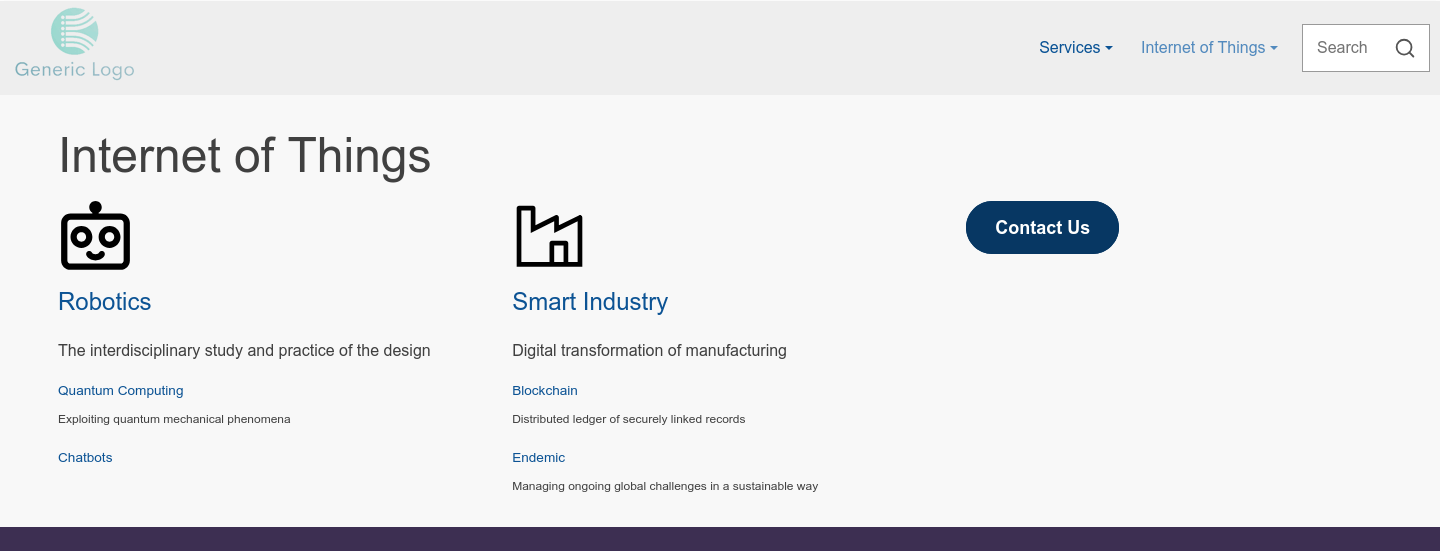
- The menu tree can be 3 levels.
- There's an option to show the title of the 1st level in the mega-menu.
- You can also select between 1-3 columns of the 2nd level items.
- Finally it's possible to set the font-size of the title, menu item and description of the different levels.
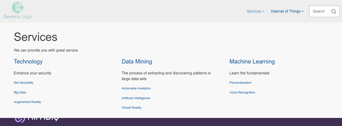
- There is support for description and images / icons per menu item. This means you can have a description below the title of the 1st level, or a descriptive text after the 2nd / 3rd level menu item.
- You can also add icons / images, like a wrench next to a 'Support' link.
- Additionally, instead of a link, you can have a button.
All of this is controlled via an Web Page Advanced Menu / Navigation Menu in HubSpot. The benefit of this is that all aspects of the menu entries can be controlled in one place and none of the titles of the pages needs to be changed to accommodate this.